More than 50% of internet traffic worldwide comes from mobile devices. This makes it imperative for websites to work seamlessly across all devices. Responsive design is crucial when creating websites, especially when using tools with a grid layout system. However, creating responsive designs can be daunting for developers.
React’s sense of flow provides satisfying control in such scenarios, particularly when working with responsive grid layout props to fine-tune elements. In today’s environment, details matter. Responsive designs are now a standard for performance. They increase user interaction and satisfaction. As mentioned earlier, the React grid layout system helps here.
It offers an organized yet flexible approach to building layouts, using grid attributes and a layout array for better customization. These layouts can scale across various devices with a specific number of columns, enhancing user experiences. Additionally, rebuilding grid layouts becomes simpler when using modern tools. This article explains the significance of responsive design.
It also highlights what makes React’s grid system unique. Key advantages include layout versatility, easier integration, and greater productivity. We will discuss tools like Material-UI Grid, React-grid-layout, and ReExt. These tools help create responsive grid layouts and modern applications. Let’s explore them.
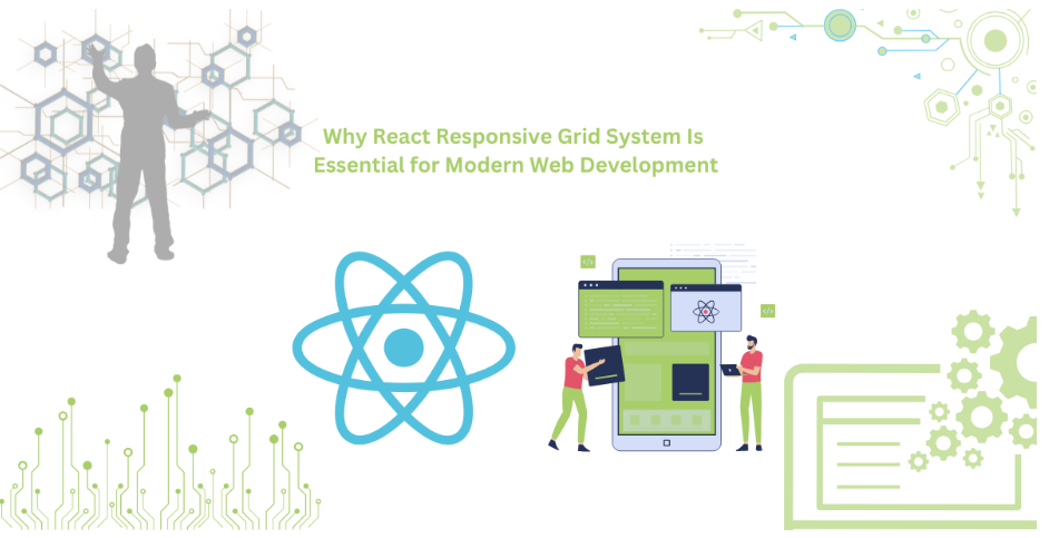
The Importance of Responsive Design in Modern Web Development
React Responsive grid design is crucial in modern web development. Users access websites through phones, tablets, and laptops. A responsive site resizes itself automatically for any device, leveraging responsive breakpoints to adapt layouts. This makes using websites easier for the end user and improves usability across grid items.
E-commerce sites like Amazon are prime examples. Responsive design allows browsing and buying on any device. News platforms like BBC have also adapted resizable grid layouts. This ensures smooth experiences on small devices while maintaining usability on larger ones, even during window resize events.
Responsive layouts also boost search engine optimization (SEO). Mobile-compatible sites perform better with search engines, especially Google. Using responsive breakpoint grid items, along with grid layout props like RGL, simplifies the process. Developers can use grid units, object mapping breakpoints, and cols and layouts objects to enhance flexibility and maintain consistency.
Remote work has increased the need for responsive design. It enhances usability, performance, and engagement. By integrating a resizable grid layout, websites meet these demands effectively. Websites must now be responsive to succeed in competitive spaces.
What Is React’s Responsive Grid System?
In simple terms, a responsive grid system in React simplifies adaptive designs. It helps developers create websites that adjust to screen sizes. The system uses React’s component-focused architecture and grid components to achieve responsive, fluid designs.
A grid consists of rows and columns, with developers able to specify layout properties and grid width for specific devices. For instance, six columns on a widescreen display might reduce to two on a smaller screen. Using div keys for each grid item ensures unique identification, which is crucial for handling updates and rendering efficiently.
Libraries like react-grid-layout and Material-UI Grid enhance functionality. Material-UI Grid supports precise grids, while React-grid-layout offers features like drag-and-drop and resizing, allowing developers to set layout properties directly. This is particularly useful when working with a more complicated layout or grid packing techniques to optimize space.
The responsive data grid in React is seamless and addresses modern web development challenges effectively. With its ability to handle a responsive grid layout and adapt to various screen sizes, it simplifies even the most complicated layout designs.
Benefits of Using React’s Responsive Grid System
React’s responsive grid system offers many advantages. It enhances flexibility, efficiency, and user experience. These features make it a powerful tool for modern web development.
Flexibility in Layouts
React’s grid system offers flexibility, efficiency, and a better user experience. Developers can create layouts that respond to various screen sizes. Breakpoints determine component size and placement on different devices. For example, a sidebar might occupy four columns on a desktop. On a mobile device, it can reduce to a single row.
Seamless Integration
The grid system integrates well with tools like Material-UI and Bootstrap. This ensures smooth transitions during development. Developers can incorporate the grid system into their workflows effortlessly.
Performance at Scale
It handles complex designs with ease, even with large data sets. For instance, a dashboard with multiple widgets remains responsive. This shows the system’s reliability and scalability.
Unmatched Efficiency
Its component-based architecture boosts productivity. Developers can reuse grid components and avoid repetitive coding. Layout definitions need to be provided only once. These efficiencies save time and effort across projects.
Consistent User Experience
The unified layout of the grid system guarantees continuity across devices. Websites operate consistently on mobile and desktop. For example, a shopping cart is the same feature across all pages. This leads to higher user satisfaction and confidence.
Ease of Customization
Customization is simple and adaptable. Developers can adjust the grid’s behavior, style, and layout. It includes features like custom breakpoints for technology accommodation. This meets the requirements of any project.
Must-Try Tools for React Grid Systems
React developers have various options for React data grid systems. A visually appealing, responsive web application needs good grids. Among the top options are ReExt, Material-UI Grid, and React-grid-layout. Each serves different purposes with its pros and cons.
ReExt
ReExt is an advanced and flexible component library built on React. It is efficient and ideal for data-driven applications with dynamic layouts. The design is responsive and transitions seamlessly across devices.
ReExt works well with other frameworks and libraries. It uses column-based layout management, offering precise control. Grid configurations can be programmed for optimized performance rendering. It handles large datasets without stalling. If flexibility and power are priorities, ReExt is the best choice.
Material-UI Grid
Material-UI Grid is from MUI and follows Google’s Material Design standards. It is popular for its simple, easy-to-use API. The grid uses a flexible box layout structure, simplifying responsive design creation.
A standout feature is breakpoints, which control layouts across display sizes. Nesting allows composed designs to layer within others. Material-UI Grid is beginner-friendly but supports advanced projects. Its comprehensive community and documentation make it a strong option.
React-grid-layout
React-grid-layout is for building draggable, drop layouts. It enables interactive grid-based designs where components can shift on the display.
Key features include automatic packing, layout customization, and state management. Developers can save and restore layouts easily. It suits dashboards and productivity applications. Its user interaction features make it worth trying.
Conclusion
A grid system is a core module of React libraries for modern website development. It simplifies creating multi-screen compatible designs. Users experience the same effectiveness and aesthetics across devices.
Material-UI Grid, React-grid-layout, and ReExt offer powerful solutions. They include breakpoints, adjustable components, and drag-and-drop options. These tools make development efficient.
Grid systems save time and increase productivity. They enable simple, flexible, and user-friendly applications. Using these tools helps meet the demand for responsive designs in the competitive digital age.
FAQs
Why is responsive design important for modern web development?
Responsive design ensures websites adapt to various devices, improving usability and user satisfaction.
Can React’s grid system be integrated with other CSS frameworks?
Yes, React’s grid system works seamlessly with frameworks like Bootstrap and Material-UI.
What are some real-world use cases for React’s responsive grid system?
E-commerce sites, dashboards, and news platforms benefit from React’s flexible and dynamic layouts.
Unlock the power of dynamic layouts with ReExt—build responsive apps effortlessly!

Understanding Your Customers: The Power of Market Research

Role Of Oven Toaster Grillers In Meal Prepping For Busy Professionals

Which Is the Best Shipping Option from the USA to India: Sea or Air?

How to Blend Home & Gym Workouts: A Balanced Routine for Everyone from Reddit Users

What is a Capacitive Switch and How It Works?

Top Services Offered by an Artificial Intelligence Automation Agency

How Can AI-Powered Inbound Call Centers Improve Customer Satisfaction?