Are you pouring your heart and soul into your mission, but your website feels more like a dusty old filing cabinet than an inspiring call to action?
Let’s be real, your website is often the first handshake you have with a potential donor, volunteer, or someone who needs your help. It’s your 24/7 storyteller and fundraiser, working tirelessly to amplify your cause.
We’re going to explore some truly amazing nonprofit websites and break down exactly what makes them tick. Our goal is to help you transform your own site into the powerhouse it deserves to be, driving greater engagement and support for your invaluable work.
What Makes a Nonprofit Website Truly Shine?
We’ll dive into how effective nonprofit websites achieve mission clarity, facilitate easy donations, ensure mobile-friendliness, and tell compelling stories that move people to act.
When we talk about nonprofit website designs that truly shine, we’re discussing a blend of essential functionalities, compelling visual storytelling, and an intuitive user experience (UX). It’s not just about looking pretty, right?
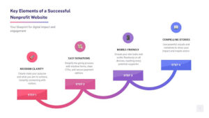
A great site needs to work hard for your mission, serving as your most dedicated digital volunteer. We’re talking about a clear mission statement that grabs visitors, navigation so simple anyone can use it, and visuals that tell a powerful story without a single word.
Research shows that 75% of online consumers admit to making judgments on a company’s credibility based on its website design. For nonprofits, this means a well-designed site isn’t just an asset; it’s a necessity for building trust and establishing authority. Your website is often the first, and sometimes only, impression you make on potential supporters, so making it count is everything.
First Impressions Matter: The Power of Visuals
Your website’s visual elements are your opportunity to create an immediate emotional connection. Think of your hero banner as your big, welcoming smile. Using engaging banners, high-quality imagery, and impactful video storytelling can instantly convey your mission and connect with visitors.
Show the faces of those you help, the hands of your volunteers at work, or the tangible impact of your efforts. A picture really is worth a thousand words – and perhaps a thousand donations! For instance, the Colorado Ballet website is a masterclass in using jaw-dropping imagery of dancers in action to generate interest and communicate the beauty of their art. Similarly, The Africa Center leverages a video background to create an immediate and immersive visual impact, effectively drawing visitors into their world. These powerful visuals are crucial for captivating your audience and making them feel invested in your cause from the moment they land on your page.

Making it a Breeze for Your Visitors
Have you ever tried to use a website on your phone and had to pinch and zoom like a detective? It’s frustrating, to say the least! For nonprofit websites, a user-friendly and mobile-responsive design isn’t just a nice-to-have; it’s crucial. According to the 2024 NPTforgood study, mobile users represented 52% of all visits to nonprofit websites, meaning over half of your potential audience is accessing your site on a smaller screen. Your site absolutely must look and work beautifully on a mobile device. A poor mobile experience can lead to high bounce rates, meaning potential supporters leave your site almost immediately, which is a significant missed opportunity for engagement and donations.
Intuitive navigation is key to a positive user experience. Visitors should be able to find what they’re looking for quickly and easily, whether it’s your mission statement, donation page, or volunteer opportunities. Websites like Mercy-USA exemplify this with a streamlined, intuitive design that uses a clean layout and ample white space, making navigation effortless.
Beyond mobile responsiveness, accessibility is paramount. Your website should be designed to be inclusive of all users, including those with disabilities. This means incorporating features like alternative text for images, sufficient color contrast, and logical headings. The California Wellness Foundation is a prime example, conforming to the Level AA standards of the Web Content Accessibility Guidelines (WCAG), ensuring their site is usable by a broad audience. Getting this right is a cornerstone of what makes a truly FZP Digital responsive nonprofit design so effective, ensuring your message reaches everyone, everywhere. For a deeper dive, explore FZP Digital responsive nonprofit design.
Let’s Talk Donations: Turning Clicks into Contributions
For nonprofits, the website is a primary engine for fundraising and donations. Optimizing this aspect is non-negotiable. Your “Donate” button should be the easiest thing to find on your website—no treasure hunt required! Once a visitor clicks, the donation form needs to be streamlined and efficient. Ask only for what you absolutely need, keeping the form short and sweet to minimize friction. Every extra field is a potential reason for a donor to abandon the process, so simplicity is paramount.
Consider offering options like monthly giving, which is a fantastic way to build sustainable support and predictable revenue. Many successful nonprofits, like Freedom Service Dogs, prominently display their monthly giving program on their homepage. Furthermore, integrate clear calls to action (CTAs) throughout your site, guiding visitors toward supporting your cause. The Fredericksburg Regional Food Bank excels at this, with clear CTAs like “Donate” and “Volunteer” that stand out.
Transparency is also vital in the donation process. Show donors how their contributions make a difference. charity: water is a pioneer in this, with their “WaterProof” system that allows donors to track their donations through photos, GPS coordinates, and stories of change, demonstrating 100% of public donations go directly to projects. This level of transparency builds immense trust and encourages continued support. Making the process so seamless and secure that giving feels good from start to finish is the ultimate goal.
Inspiring Examples: Our Favorite Nonprofit Websites
Let’s take a peek at some organizations that are knocking it out of the park with their online presence! These websites not only look great but also effectively communicate their mission and drive engagement.
- charity: water: We love how charity: water uses stunning visuals and transparent impact reports to build trust. Their “WaterProof” system is a game-changer, allowing donors to see exactly where their money goes with photos and GPS coordinates. This innovative approach fosters a deep sense of connection and accountability.
- The Malala Fund: Notice how The Malala Fund uses bold colors, compelling statistics, and clear CTAs to empower visitors to take action for girls’ education worldwide. Their website beautifully balances storytelling with strong calls to involvement, inspiring visitors to become advocates.
- Elton John AIDS Foundation: The Elton John AIDS Foundation exemplifies effective nonprofit design, balancing elegance and functionality. Their focus on storytelling, streamlined donation process, and interactive sections, including a global impact map, highlight the tangible results of donor contributions. This makes it simple for users to explore their work and feel connected to the cause.
- World Wildlife Fund (WWF): The World Wildlife Fund stands out with its creative donor engagement opportunities. Beyond stunning imagery of wildlife, they feature interactive eCards and quizzes, turning their website into an engaging platform that encourages supporters to share their passion for conservation.
- The Bill & Melinda Gates Foundation: The Bill & Melinda Gates Foundation offers an impressive example of nonprofit web design with its clean, modern layout and visually appealing presentation. Their interactive timeline, which tells the foundation’s history with engaging images and stories, is a particularly unique feature, providing a high-level overview of their growth and impact over the years.
Each of these sites tells a powerful story and makes it incredibly easy for visitors to become part of their mission. They are not just information hubs; they are platforms for change.
The FZP Digital Approach: Building Websites That Build Relationships
This is where we get really excited, because we believe a website should be more than just a tool—it should be a relationship-builder. It’s about creating a warm, welcoming space that reflects the heart of your organization, fostering genuine connections with your audience. This philosophy is at the core of our approach to nonprofit design, focusing on human connection first.
Key Elements of FZP Digital Nonprofit Designs
Our designs are rooted in a story-first approach. Instead of just listing facts and figures, we focus on weaving a compelling narrative throughout your site. How can we show your impact through an interactive map, a wall of supporter stories, or powerful video testimonials? We integrate community engagement features like social media feeds, forums, and volunteer sign-up forms to turn passive visitors into an active, invested community. For example, buildOn uses captivating videos and imagery to communicate its mission and programs, effectively engaging visitors. Similarly, The Wilderness Land Trust uses an imagery-rich site and a blog-style “Stories” page to showcase its impact through narratives of places and people. This approach makes your mission tangible and invites participation.
Why FZP Digital Nonprofit Designs Prioritize SEO
Here’s the tough-love moment: a beautiful website is useless if no one can find it. Navigating Search Engine Optimization (SEO) can feel like learning a new language, right? It’s complex, constantly changing, and requires specialized knowledge. That’s why a strategic partner is so crucial—to handle the technical stuff so you can focus on your mission.
We prioritize SEO for several reasons. Firstly, it ensures your website ranks higher on search engines, making it easier for potential donors, volunteers, and beneficiaries to find your organization. Tools like the Google Ad Grant program, which offers eligible nonprofits $10,000 a month in free advertising, can significantly amplify your reach when combined with a strong SEO strategy. By optimizing your website and leveraging these grants, you can broaden your audience and empower more support for your cause.
Secondly, a robust content strategy, driven by keyword research and audience insights, allows us to create content-rich and educational sites. By understanding what your audience is searching for, we can develop valuable content that answers their questions and informs them about your work. This not only improves your search engine visibility but also builds incredible trust and authority. For instance, The Community Foundation of Sarasota County’s blog provides valuable insights, anticipating reader questions and offering straightforward answers, which helps build trust and positions them as an authority. This strategic approach to content and SEO transforms your website into a powerful educational resource and a trusted voice in your field.
Your Next Steps to a Website That Wows
So, feeling inspired? We hope so! Your website is a living, breathing part of your mission, and with the right design and strategy, it can become your most powerful tool for change.
Start by looking at your own site through the eyes of a first-time visitor. Is your story clear and compelling? Is it easy to get involved, whether through donations, volunteering, or learning more? Don’t be afraid to start small—even updating your photos, simplifying your donation form, or refining your navigation can make a huge difference.

If you’re ready to take your nonprofit’s online presence to the next level, combining stunning visuals, intuitive navigation, clear calls to action, and a strong SEO strategy will empower your mission like never before. You’ve got this, and we’re here to help you every step of the way.
Microsoft Teams Dynamics 365 Integration: The Complete Guide

The ROI of User Experience Design Services: What the Data Really Shows

Digital Harmony at Home: The Combined Power of Bakcell Wi-Fi and Mobile Internet
