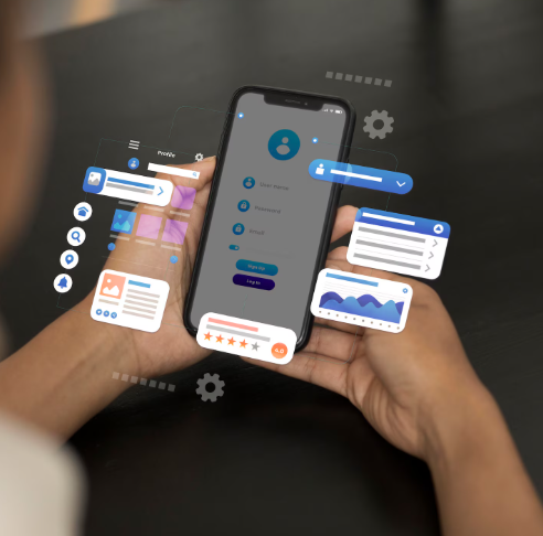
Flutter is an open source platform and supports many software developers to create stunning apps. The platform is helpful for developers to build high-performance, responsive, and visually appealing apps for Android and ios devices.
If you wish to use such a platform for your next project, you can hire flutter developers and get support throughout the project. They help you in every step and complete them as soon as possible. Widget is an important part of the project.
- The widget acts as a building block of the app user interface.
- When working with the Flutter platform, you can discover a new widget package on pub.dev.
- You may check the Flutter newsletter and scroll down the pub.dev list that shows the recent package.
- Juxtapose is a stunning package for the future Flutter project.
Widget is simple and easy to use on a project. When it comes to juxtapose, you can look at basic setup and usage. A basic visual element helps developers to swipe the screen to show different widgets or trees of widgets.
Developers create an appealing user interface and define functionality. It is described as a reusable piece of code that reveals how to compare stacked widgets. All the necessary things combine and arrange differently to make an impressive interface.
About juxtapose in a flutter:
When making a perfect user interface, developers highly prioritize the widget. It plays a vital role in developing dynamic and responsive apps. In pub.dev, you can get the latest news about the special package like juxtapose. It is quite simple and helpful for the future project. The package is fairly easy to utilize in Flutter app development. After setting up a package, you can test it with a basic application.
Set up:
Before starting working with the widget, you need to add juxtapose to pubspec.yaml
Dependencies
Juxtapose: ^1.0.2
After that, you can add a package to the dart file
import ‘package: juxtapose / juxtapose.dart’;
Procedure for juxtapose in a flutter:
The main aim of juxtapose is to swipe the screen and show different widgets or trees. The foreground widget is present on the left, and the background widget is present on the right. Flutter developers use it simply to call widgets and pass it with both images with ideal background color. A different range of properties may also add to the widget for further customization. Developers try it with basics.
Juxtapose (
backgroundColor: Color ( 0xFF012747 ),
foregroundWidget: Image.asset ( “flutter-logo.png” ),
backgroundWidget: Image.asset ( “flutter-logo-stroke.png” ),
),
The above code shows how to juxtapose two different widgets. The widget inside will develop and load space by itself. You can also wrap the center before resizing.
Juxtapose (
backgroundColor: Color (0xFF012747),
foregroundWidget: Center (
child: Image.asset (“flutter-logo.png”, width: 400),
),
backgroundWidget: Center (
child: Image. asset (“flutter-logo-stroke.png”, width: 400),
),
),
Juxtapose procedure is simple and builds both widget with matching background color. For customization, developers use other properties to make user interface friendly.
Juxtapose (
foregroundWidget: Container (
alignment: Alignment.center,
color: Color (0xff8c52ff),
child: Text (
“BleylDev”,
style: TextStyle (color: Colors.yellow, font size: 40),
),
),
backgroundWidget: Container (
alignment: Alignment.center,
color: Color (0xff02539a),
child: Text (
“BleylDev”,
style: TextStyle (color: Colors.white, font size: 40),
),
),
)
You can opt for an expanded widget if you want to use a package in a row or column widget.
Column (
children: <Widget> [
Expanded (
child: Juxtapose (
foregroundWidget: Container (
alignment: Alignment.center,
color: Color (0xff8c52ff),
child: Text (
“BleylDev”,
style: TextStyle (color: Colors.yellow, font size: 40),
),
),
backgroundWidget: Container (
alignment: Alignment.center,
color: Color (0xff02539a),
child: Text (
“BleylDev”,
style: TextStyle (color: Colors.white, font size: 40),
),
),
),
),
],
)
Juxtapose is a reliable flutter widget to evaluate the difference between two widgets on the interface. It lets users identify variations between two images. Developers use this widget package to make prominent and richer applications.
Keep perfect structure:
The widget tree works as a hierarchical structure that classifies the user interface of the app. The widget symbolizes specific components of the user interface. Juxtapose package assists developers in keeping and how widget or widget tree clear. Below is a simple example of juxtapose.
import ‘package:juxtapose/juxtapose.dart’;
import ‘package:flutter/material.dart’;
void main() {
runApp(MyApp());
}
class MyApp extends StatelessWidget {
@override
Widget build(BuildContext context) {
return MaterialApp(
title: ‘Juxtapose Demo’,
theme: ThemeData(
primarySwatch: Colors.blue,
visualDensity: VisualDensity.adaptivePlatformDensity,
),
home: Juxtapose(
foregroundWidget: Container(
alignment: Alignment.center,
color: Colors.blue,
child: Text(
“Juxtapose”,
style: TextStyle(color: Colors.white, font size: 40),
),
),
backgroundWidget: Container(
alignment: Alignment.center,
color: Colors.pink,
child: Text(
“Juxtapose”,
style: TextStyle(color: Colors.black, font size: 40),
),
),
),
);
}
}
API reference:
Before dividing into packages, you must look at API references. With the advent of technology, you can search well on the internet and get accurate details about the property. You can locate the pub.dev official site and gather important details. Also know more about how to store API keys in Flutter.
- Foregroundwidget – widget reveals in front of background widget
- Background widget – Widget shows after foregroundwidget
- Height – denotes juxtapose box height
- Width – denotes juxtapose box width
- Direction – sliding direction for juxtaposing between two images
- Backgroundcolor – colors.transparent is the default. It determines the juxtapose box background color
- dividerColor – colors.white is the default. Represent vertical or horizontal divider color
- Divider thickness – indicate vertical and horizontal divider line thickness
- Thumbcolor – colors.white is default. Thumb color can drag to juxtapose.
- Thumbsize – size (12, 100) is the default. Denotes thumb widget size and width is short, and height is long
- thumborderRadius – borderradius.circular(4) is default. The main aim of such property is to set thumb widget border-radius
- shows arrows – denotes if arrows on the thumb sides are shown or not
The above properties are important in juxtaposing widget packages to create a prominent interface. Developers must understand more about the property and utilize packages properly in the projects.
Conclusion:
The above information and illustration are useful for an individual who wants to work with the Flutter framework for a future project. If you have any doubts regarding the widget package, you can hire flutter developers and get perfect assistance. They assist an individual in using the Flutter widget package and build a prominent app with a good-looking interface.

Digital Harmony at Home: The Combined Power of Bakcell Wi-Fi and Mobile Internet

Legacy vs Modern Applications: Where UI Design and AI Make the Difference

5 AI Tools That Are Actually Worth Paying For in 2026 — Tested for Small Business


