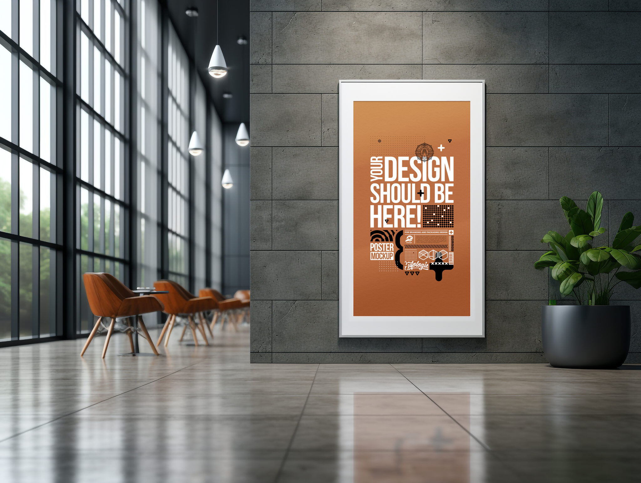
Workplace posters have the potential to be powerful tools. They can boost morale, inspire creativity, and even improve safety. But let’s face it, not all workplace posters are created equal. In fact, many end up gathering dust in a forgotten corner, failing to deliver on their intended impact.
So, how do you design workplace posters that actually work? It all boils down to understanding your audience, crafting the right message, and using effective design principles. This guide will walk you through the essential steps to create impactful posters that resonate with your employees and achieve your desired goals.
Understanding Your Audience and Goals:
Before you even pick up a pen or open a design software, take a step back and consider the following:
Define your goals
What do you want your poster to achieve? Is it to boost morale, encourage teamwork, remind employees of safety protocols, or promote a new company initiative? Having a clear goal in mind will guide your design choices and ensure your message is targeted.
Know your audience
Who are you trying to reach with your poster? Consider their demographics, interests, and pain points. What kind of language and visuals will resonate with them? For example, a poster aimed at young tech workers might be more effective with a playful tone and modern design, while a poster for an older audience in a more traditional workplace might require a more formal approach.
Choose the right location
Where will you display your poster? Will it be in a high-traffic area where everyone sees it, or in a more specific location like a break room or conference room? The placement will influence the design and size of your poster.
Design Essentials for Impact
Once you have a clear understanding of your audience and goals, it’s time to think about the visual elements of your poster. Here are some principles to keep in mind:
Visual hierarchy
Visual hierarchy refers to the arrangement of elements on your poster in a way that guides the viewer’s eye to the most important information first. Use elements like size, color, and placement to create a clear hierarchy and ensure your message is seen and understood.
- Dominant element: Your poster should have a single dominant element that grabs attention and communicates the main message. This could be a bold headline, a striking image, or a strong graphic.
- Secondary elements: Use supporting elements like subheadings, icons, and data visualizations to provide additional information and context.
- White space: Don’t overcrowd your poster. Give your elements room to breathe and make the key message stand out.
Typography
Choose fonts that are easy to read at a glance and fit the overall tone of your message. Avoid using too many different fonts or overly decorative typefaces that can distract from the content. Make sure your text has enough contrast with the background to be easily readable.
Imagery and symbolism
Images can be powerful tools for grabbing attention and conveying emotions. Choose visuals that are relevant to your message and resonate with your audience. Avoid generic stock photos and opt for unique or relatable images that will make a lasting impression.
Right Message
The content of your poster is just as important as the design. Here are few tips for crafting the right message:
- Conciseness is king: Keep your message short and sweet. People are busy, and they won’t stop to read a longwinded paragraph on a poster. Aim for a single, clear sentence that gets your point across.
- Positive and actionable language: Use positive and encouraging language that motivates and inspires your employees. Avoid negativity and jargon, and focus on what you want them to do or how you want them to feel.
- Use a call to action: Tell your viewers what you want them to do after seeing your poster. Do you want them to visit a website, participate in a program, or simply change their behavior? Make it clear and easy for them to take the next step.
Testing and Refining for Optimal Impact
Don’t just assume your poster is perfect the first time around. Get feedback from your target audience and test different designs and messages to see what resonates best. Once you have a final version, monitor its effectiveness and make adjustments as needed.
Placement Matters
Where you place your poster can significantly impact its effectiveness. Choose high-traffic areas where employees are likely to see it, but avoid places where it will be easily missed or hidden behind clutter. Consider the purpose of your poster and place it strategically to maximize its reach.
Conclusion
Designing effective workplace posters takes more than just slapping some text and clipart on a piece of paper. By understanding your audience, crafting the right message, and using effective design principles, you can create posters that truly work. Remember, your posters are a reflection of your company culture, so make sure they send the message you want your employees to receive.

What Are the Benefits of a Ruffled Shower Curtain for Homeowners?

What Sets a Top Marketing Video Agency Apart from the Rest

Winnipeg Kitchen Countertops – Which One Suits You?


