Introduction: Embracing the Multi-Device Reality
Think about your daily online habits. Are you browsing on a large desktop monitor, a portable tablet, or your smartphone while out and about? The answer is likely all three, and often within the same hour.
In today’s digital world, users expect websites to perform flawlessly on any device they choose. A website that forces pinching and zooming quickly leads to frustration and a lost visitor.
This is why responsive web design (RWD) has become essential. It’s an approach that ensures your website automatically adapts its layout and content to fit any screen size. This provides an optimal viewing experience for everyone.
The concept was first introduced by web designer Ethan Marcotte. Responsive design changed how we build websites. It moved us away from creating separate sites for different devices.
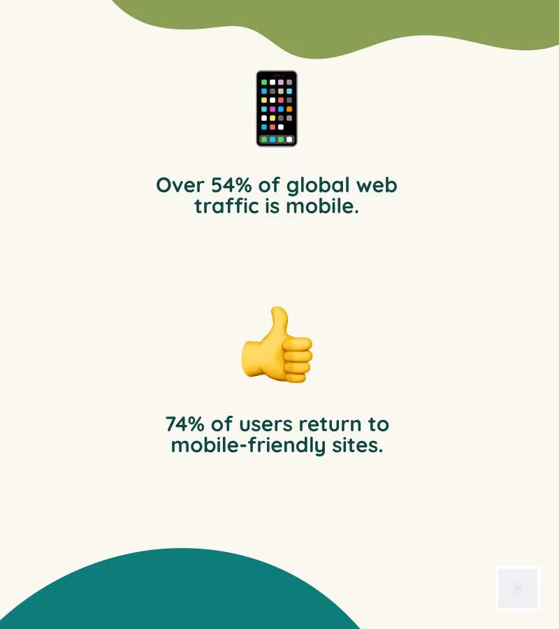
Today, over 54% of all global website traffic comes from mobile phones. We know that 74% of online users are more likely to return to a mobile-friendly site. Even Google prioritizes mobile-friendly sites in its search rankings.
Clearly, a fluid and adaptable online presence is no longer a luxury. It’s a fundamental requirement for success. Understanding how to achieve strategic responsive web design is crucial for your digital presence.
This guide will walk you through everything you need to know. We’ll cover the core components of RWD, its benefits for user experience and SEO, common challenges, and practical solutions.
The Three Pillars of Responsive Architecture
At its heart, responsive web design is built upon a trio of fundamental techniques that work in concert to deliver adaptable layouts. These core components, fluid grids, flexible images, and CSS media queries, are the technical bedrock that allows a single website to seamlessly adjust to countless screen sizes and orientations.
Fluid Grids
Gone are the days of fixed-width layouts, where content would either overflow or leave vast empty spaces depending on the screen. Fluid grids, a cornerstone of RWD, use relative units like percentages (instead of fixed pixels) for layout dimensions.
This means that elements on your webpage, such as columns, sidebars, and content blocks, automatically resize proportionally to the viewport’s width. As the screen shrinks or expands, the grid maintains its structure, simply becoming narrower or wider, ensuring content always fits without horizontal scrolling.
Flexible Images
Images are often the heaviest elements on a webpage and can easily break a responsive layout if not handled correctly. Flexible images (sometimes called fluid images) ensure that visual content scales appropriately within its containing element. By applying simple CSS rules like max-width: 100% and height: autoImages will shrink to fit their parent container while maintaining their aspect ratio, preventing overflow or distortion. More advanced techniques involve using the <picture> element or srcset attributes to serve images at different resolutions or crops based on the device’s capabilities, optimizing both visual quality and load times.
CSS Media Queries
Media queries are the “brains” of responsive design, allowing us to apply different CSS styles based on specific device characteristics. Coined by Ethan Marcotte, this powerful CSS3 feature enables developers to define “breakpoints” – specific screen widths (or other features like orientation, resolution, or even pointer type) at which a website’s layout or styling should change.
For instance, a media query can tell a browser: “If the screen width is less than 768 pixels, stack these three columns vertically instead of horizontally.” This provides granular control over how content is presented, ensuring optimal readability and interaction on every device. You can dig into the fundamentals of media queries to understand their syntax and application.

Responsive vs. Mobile-Friendly: A Critical Distinction
While often used interchangeably, “responsive web design” and “mobile-friendly design” represent different approaches to adapting websites for smaller screens. Understanding this distinction is crucial for making informed strategic decisions.
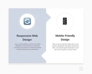
Mobile-Friendly Design typically refers to a website that works adequately on mobile devices. This might involve creating a separate, dedicated mobile version of the site (often on a subdomain m.yourwebsite.com) or simply ensuring the desktop site is somewhat usable on a phone, perhaps with larger text and buttons. The key characteristic here is often a separate codebase or a less dynamic adaptation. While a mobile-friendly site might pass Google’s Mobile-Friendly Test, it doesn’t necessarily offer the seamless, integrated experience of a truly responsive site.
Responsive Web Design (RWD), on the other hand, uses a single codebase and a unified design that dynamically adjusts to any screen size, from the smallest smartphone to the largest desktop monitor. It’s about fluid adaptation rather than distinct versions. This means the same HTML, CSS, and JavaScript files are served to all devices, with media queries altering the presentation layer.
Modern Layout Techniques
Beyond the foundational pillars, modern CSS has introduced powerful layout modules that make responsive design even more intuitive and efficient.
- CSS Flexbox (Flexible Box Layout Module): Designed for one-dimensional layouts (either rows or columns), Flexbox allows items within a container to be easily aligned, distributed, and ordered. It excels at distributing space among items and aligning them within a container, making it ideal for navigation menus, cards, and other components that need to adapt to available space. Learn more about Flexbox.
- CSS Grid Layout: For two-dimensional layouts (rows and columns simultaneously), CSS Grid is the go-to solution. It enables designers to define complex grid structures and place items within them, providing robust control over the entire page layout. Grid is ideal for overall page structure, allowing sections to rearrange themselves gracefully across different screen sizes. Explore CSS Grid Layout for advanced layout control.
- Viewport Units (vw, vh): These relative units (vw for viewport width, vh for viewport height) allow elements to scale directly with the user’s viewport size. For example, 1vw it is 1% of the viewport width. They are particularly useful for responsive typography, as they ensure text sizes adjust dynamically to the screen. However, it’s important to combine them with other units (like rem or em) using calc() to maintain user zoomability.
- The Viewport Meta Tag: This seemingly small piece of HTML is critical for mobile browsers. Placed in the <head> middle of your document, <meta name=”viewport” content=”width=device-width, initial-scale=1″> tells mobile browsers to set the viewport width to the device’s actual width and render the page at 1:1 scale. Without it, mobile browsers might default to rendering a desktop-sized page and then zoom out, completely negating your responsive efforts. Lighthouse audits can help identify whether your site lacks a meta name=”viewport” tag with width or initial-scale.
The Business Case: Why Strategic Responsive Web Design is Non-Negotiable
Implementing responsive web design isn’t just a technical trend; it’s a strategic business imperative that yields significant returns. For businesses across various sectors (e-commerce, B2C, B2B), the benefits extend far beyond aesthetics, directly impacting user engagement, brand perception, and ultimately, the bottom line.
Improved User Experience (UX)
A core tenet of responsive design is user-centricity. By adapting seamlessly to any device, RWD eliminates common frustrations such as horizontal scrolling, tiny text, and unclickable buttons. This creates a fluid, intuitive browsing experience regardless of how a user accesses your site. A positive user experience translates to longer dwell times, lower bounce rates, and increased satisfaction. This is crucial because, as statistics show, 74% of online users are likely to revisit a website with a mobile-friendly design. Responsive design ensures your website remains accessible, visually appealing, and functional across all devices, enhancing overall UX.
Brand Consistency Across Devices
In an increasingly fragmented digital landscape, maintaining a consistent brand image is paramount. Responsive design ensures that your website’s visual identity, messaging, and functionality remain uniform across desktops, tablets, and smartphones. This reinforces your brand’s professionalism and reliability, building trust with your audience. Whether a customer is browsing products on their desktop or checking store hours on their phone, your brand’s experience remains cohesive and recognizable. This consistency guides users to calls to action (CTAs) that drive sales, establishing a clear, uniform user journey.
Future-Proofing Your Digital Presence
The pace of technological change is relentless, with new devices and screen sizes emerging constantly. Responsive web design offers a degree of future-proofing by building a website that is inherently flexible. Instead of needing a complete overhaul every few years to accommodate new devices, a responsive site can adapt to unforeseen screen dimensions. This scalability ensures your website remains relevant and effective, protecting your initial investment and reducing long-term development costs.
Scalability for Growth
As your business grows, your website needs to grow with it. Responsive design facilitates this by providing a flexible framework that can easily incorporate new content, features, and functionality without compromising the user experience across devices. This adaptability is particularly valuable for businesses like e-commerce platforms, B2C brands with evolving product lines, and B2B companies expanding their service offerings.
Consider the success stories:
- QuickBooks: Their website maintains a clean, intuitive interface across devices, ensuring business owners can manage finances seamlessly on desktops and mobile apps.
- Harvard Business Review: Delivers complex articles with excellent readability and navigation on both large and small screens, adapting content presentation without sacrificing depth.
- Converse: Their e-commerce site provides a consistent shopping experience, from browsing product catalogs on a desktop to making a purchase on a smartphone.
- The New York Times: A prime example of how responsive design can deliver vast amounts of daily content in an easily digestible format across all devices.
- Shopify: Their platform itself is a testament to responsive design, allowing merchants to manage their stores and customers to shop from any device.
These examples demonstrate how responsive solutions cater to diverse business needs, from e-commerce to B2B and B2C models, by ensuring optimal viewing and interaction experiences. For more insights into the importance of website quality, explore why Why Good Website Design Matters.

The SEO Impact of Strategic Responsive Web Design
Responsive web design is not merely a user experience improvement; it’s a critical component of a robust SEO strategy. Google has made its preference clear: responsive websites are favored in search rankings, directly impacting your site’s visibility and organic traffic.
- Google’s Mobile-First Indexing: Since 2018, Google has shifted to mobile-first indexing, meaning its algorithms primarily use the mobile version of your content for indexing and ranking. A responsive site, with its single URL and consistent content across devices, ensures that Google’s crawlers can easily access and understand your content, avoiding potential issues with separate mobile sites. This direct recommendation from Google prioritizes mobile-friendly sites in its ranking algorithm, making responsive design a non-negotiable for search engine visibility.
- Improved User Experience Signals: Google’s ranking algorithms increasingly rely on user experience signals. A responsive website naturally leads to lower bounce rates (users leaving quickly), longer session durations, and higher engagement, all of which are positive indicators for search engines. Websites that are difficult to navigate on mobile devices will see users “pogo-sticking” back to the search results, signaling a poor experience to Google.
- Faster Load Times: Responsive design, when implemented correctly, can improve page load times. Techniques like fluid images and optimized asset delivery ensure that mobile users aren’t burdened with unnecessarily large files. This is crucial because 53% of mobile users abandoned a site if it takes more than three seconds to load. Faster load times improve both the user experience and search engine rankings, especially by affecting Core Web Vitals, which are key ranking factors.
- Single URL Advantage: With a responsive site, you maintain a single URL for all versions of your content. This simplifies SEO efforts by consolidating link equity, making it easier for search engines to crawl and index your site, and eliminating potential duplicate content issues that can arise with separate mobile URLs.
For any business aiming to dominate search results and capture a wider audience, investing in Strategic responsive web design is a fundamental step. It’s not just about adapting to current search trends; it’s about aligning with Google’s long-term vision for a user-friendly web.
Driving Conversions and ROI
Beyond SEO, the tangible impact of responsive web design on a business’s bottom line is undeniable. A well-executed responsive strategy directly contributes to higher conversion rates and a significant return on investment (ROI).
- Streamlined User Journey: By providing a consistent, intuitive experience across all devices, responsive design ensures a seamless user experience. Users can easily navigate, find information, and complete desired actions (such as making a purchase or filling out a form) without encountering device-specific roadblocks. This smooth path minimizes friction, guiding users efficiently through your sales funnel.
- Increased Mobile Conversions: With more than half of global website traffic originating from mobile devices, optimizing for these users is paramount. Responsive design directly addresses this by making your site fully functional and appealing on smartphones and tablets, leading to higher engagement and, crucially, increased mobile conversions. Businesses offering responsive e-commerce design, for instance, see significant sales boosts from mobile shoppers.
- Reduced Cart Abandonment: For e-commerce businesses, a frustrating mobile experience is a leading cause of cart abandonment. Responsive design mitigates this by ensuring product pages load quickly, images are clear, and the checkout process is straightforward on smaller screens. Establishing a consistent visual hierarchy and user journey across devices helps guide users to CTAs that drive sales.
- Lower Long-Term Maintenance Costs: While the initial investment in responsive design might seem higher than a quick “mobile-friendly” fix, it proves significantly more affordable and less time-consuming in the long run. You won’t have to maintain separate mobile and desktop versions, eliminating the need to update different versions of your website. This allows you to manage content in one place and ensures that changes are reflected across all devices, saving resources and reducing the risk of errors.
Responsive web design is about maximizing your website’s potential to attract, engage, and convert visitors, irrespective of their device. It’s about building a Website Design That Converts into tangible business results.
From Theory to Practice: Implementation and Best Practices
Translating the principles of responsive web design into a functional, high-performing website requires careful planning and adherence to best practices. While the core concepts are straightforward, successful implementation requires addressing technical and user-experience considerations.
Mobile-First Approach
A fundamental shift in modern responsive development is the “mobile-first” approach. Instead of designing for large screens and then scaling down, we begin by designing and developing for the smallest screens first. This forces us to prioritize content and functionality, ensuring that the most critical elements are present and easily accessible on mobile devices. Once the mobile experience is optimized, we then progressively improve the design for larger screens using media queries.
Content-Driven Breakpoints
Instead of setting arbitrary breakpoints based on popular device sizes (e.g., 768px for tablets, 1024px for desktops), best practice dictates that breakpoints should be “content-driven.” This means you adjust the layout when the content itself starts to look awkward or break. For example, if a block of text becomes too wide to read comfortably, or a navigation menu becomes too cramped, you can introduce a media query to adjust the layout. This ensures that your design truly responds to the content, rather than trying to fit content into predefined device dimensions.
Performance Optimization
Responsive design can sometimes inadvertently lead to performance issues if not handled carefully. Sending large, unoptimized images to mobile devices, for instance, can significantly slow down load times. Key performance optimization strategies include:
- Optimized Images: Use techniques like image compression, lazy loading (loading images only when they enter the viewport), and responsive image syntax (srcset, <picture>) to serve appropriately sized images for each device.
- Minified Code: Reduce CSS, JavaScript, and HTML file sizes by removing unnecessary characters.
- Browser Caching: Leverage browser caching to store static assets, speeding up return visits.
- Conditional Loading: Load certain scripts or resources only when needed, especially for device-specific functionalities.
Accessibility (WCAG)
A truly responsive website is also an accessible website. Web Content Accessibility Guidelines (WCAG) provide a framework for making web content accessible to people with a wide range of disabilities. In responsive design, this means ensuring:
- Keyboard Navigation: All interactive elements are reachable and usable via keyboard.
- Semantic HTML: Use appropriate HTML tags (ee.g, <nav>, <header>, <footer>) to convey meaning and structure to assistive technologies.
- Readable Text: Ensure sufficient contrast between text and background colors, and allow text to be resized without loss of content or functionality.
- Touch Target Sizes: Ensure buttons and links are large enough and have sufficient spacing for easy tapping on touch devices. Considering that 49% of people use their mobile device using one hand, ensuring critical CTAs are within thumb’s reach is vital.
A Practical Checklist for Getting Started
Starting on a responsive web design project, whether for a new site or an existing one, requires a structured approach. Here’s a practical checklist to guide businesses in implementing effective responsive web design solutions:
- Content Audit & Strategy: Before any design work begins, conduct a thorough audit of your existing content. Identify what’s essential, what can be simplified, and how content might be prioritized for smaller screens. Develop a content strategy that considers how information will flow and adapt across different layouts. This aligns with broader website design strategies.
- Mobile-First Design Philosophy: Always start with the smallest screen. Design the core layout and functionality for mobile devices first, focusing on essential information and user flows. Then, progressively improve the design for tablets and desktops. This ensures a solid, performant foundation for the majority of your users.
- Implement Flexible Layouts: Use modern CSS techniques like Flexbox and CSS Grid for your layouts. These are inherently responsive and provide powerful tools for distributing space and aligning elements dynamically. Avoid fixed-width elements wherever possible, opting for percentages, viewport units, and em/rem units.
- Optimize All Media: Ensure all images, videos, and other media are optimized for performance and responsiveness. Use image compression, lazy loading, and the <picture> element or srcset attributes to serve appropriate image sizes based on the device. Tools such as Bootstrap, H5P, and Elucidat can help manage responsive content.
- Define Content-Driven Breakpoints: Instead of relying on standard device sizes, identify breakpoints at which your content naturally becomes suboptimal. Test your design by gradually resizing your browser window and setting breakpoints where layout adjustments are needed for optimal readability and usability.
- Prioritize Touch-Friendliness: For mobile and tablet users, ensure all interactive elements (buttons, links, forms) are large enough to be easily tapped with a finger and have adequate spacing between them.
- Test Rigorously Across Devices: Don’t rely solely on emulators. Test your responsive design across a variety of devices, including smartphones, tablets, and desktop browsers. Use browser developer tools, such as Chrome DevTools’ Device Mode or Firefox’s Responsive Design Mode, to simulate different screen sizes and orientations.
- Performance Monitoring: Continuously monitor your website’s performance, especially load times on mobile networks. Tools like Google PageSpeed Insights can help identify and address bottlenecks.
- Accessibility Integration: Integrate accessibility best practices from the outset. Ensure proper semantic HTML, keyboard navigation, and adequate color contrast for all elements.
- Consider Cost and Provider: The cost of responsive web design services can vary significantly depending on the complexity of your website, the features you want, and the provider’s expertise. While some agencies offer affordable packages, a customized quote based on specific requirements is typical. When choosing a responsive web design services provider, look for a company with a proven track record, a strong portfolio, and a clear understanding of your business goals. They should emphasize user experience, SEO, and long-term scalability.
Common Challenges in Implementing Strategic Responsive Web Design
While the benefits of responsive web design are clear, implementing it can pose several challenges. Being aware of these potential problems allows for proactive planning and more effective solutions.
Slow Page Loads: This is a frequent issue, especially if large images or heavy scripts are not optimized for mobile. Unnecessary assets loaded on smaller screens can significantly degrade performance, resulting in higher bounce rates.
Solution: Implement aggressive image optimization (compression, srcset, picture element, WebP format), lazy loading for off-screen content, code minification, and efficient server-side rendering where appropriate.
Complex Navigation: Desktop navigation menus often become unwieldy on smaller screens. Trying to cram all links into a tiny space leads to a poor user experience.
Solution: Redesign navigation for mobile-first. Common solutions include hamburger menus, off-canvas navigation, accordions, or tabbed navigation. Prioritize essential links and simplify the menu structure.
Unoptimized Images and Media: Images that don’t scale correctly, appear blurry, or are too large can ruin a responsive layout and slow down the site.
Solution: As mentioned, use max-width: 100%; height: auto; for basic scaling. For more advanced control, leverage srcset and <picture> to serve different image files based on screen size and resolution. Consider using vector graphics (SVGs) for logos and icons.
Ensuring Touch-Friendliness: Buttons, links, and form fields designed for mouse clicks may be too small or too close together for comfortable tapping on a touchscreen.
Solution: Increase the size of touch targets (Google recommends at least 48×48 CSS pixels) and provide ample padding between interactive elements to prevent accidental taps.
Cross-Browser and Cross-Device Compatibility: Ensuring your responsive design looks and functions correctly across a myriad of browsers (Chrome, Firefox, Safari, Edge) and devices (iOS, Android, various screen sizes) can be a significant undertaking.
Solution: Consistent testing is key. Use browser developer tools, device emulators, and actual physical devices for testing. Employ CSS resets or normalize styles to minimize browser inconsistencies. Consider using platforms that offer comprehensive Responsive Web Design Challenges and Solutions testing across various environments.
Maintaining Brand Consistency: While responsive design aims for consistency, the need to adapt layouts can sometimes lead to compromises in visual branding or user flow if not carefully managed.
Solution: Establish a robust design system and style guide from the outset. Define how brand elements (colors, typography, logos) should adapt across different breakpoints while retaining their core identity.
Addressing these challenges proactively during the design and development phases is crucial to delivering a truly effective, user-friendly, responsive website.
Frequently Asked Questions about Responsive Design
To further clarify common queries, we’ve compiled answers to some frequently asked questions about responsive web design.
How does responsive design improve user experience?
Responsive design fundamentally improves user experience by eliminating the need for users to manually adjust content to fit their screen. This means no more pinching, zooming, or horizontal scrolling. Instead, the website’s layout, images, and text automatically adapt to provide an optimal viewing and interaction experience across desktop, tablet, and smartphone devices. This seamless adaptation leads to easier navigation, faster loading times (when optimized), and a consistent, enjoyable interaction with your brand across all devices. Essentially, it makes your website effortless to use, encouraging longer visits and higher engagement.
What are the most important elements to test in a responsive design?
When testing a responsive design, several key elements demand rigorous attention to ensure a flawless experience across devices:
- Layout Breakpoints: Verify that your content reflows correctly at each defined breakpoint, ensuring no elements overlap, get cut off, or leave excessive whitespace.
- Navigation Menus: Test that menus transform appropriately (e.g., from a horizontal bar to a hamburger icon) and are fully functional and intuitive on all screen sizes.
- Forms and CTAs: Ensure all form fields are easily fillable and that buttons/calls-to-action are large enough to be tapped accurately on touchscreens and are clearly visible.
- Image and Video Rendering: Confirm that images scale correctly, maintain their aspect ratio, and load efficiently without pixelation or excessive loading times. Videos should also embed and play properly.
- Page Speed on Mobile Networks: Measure load times on various mobile network conditions (e.g., 3G, 4G, 5G) to ensure a fast experience, as slow loading is a major cause of abandonment.
- Text Readability: Ensure font sizes and line heights are comfortable to read across all devices without requiring zooming.
Utilizing browser developer tools’ Device Mode can be invaluable for simulating these conditions.
Can an existing website be made responsive?
Yes, an existing website can absolutely be made responsive, though the complexity and effort involved can vary significantly. This process, often called “retrofitting” or “responsive redesign,” typically involves:
- Auditing Current Code: Assessing the existing HTML, CSS, and JavaScript to understand its structure and identify areas that need modification.
- Strategic Planning: Determining the best approach (e.g., mobile-first, content-out), defining breakpoints, and planning for content adaptation.
- Implementing Fluid Grids and Flexible Media: Converting fixed-width layouts to fluid ones and ensuring images and videos scale correctly.
- Adding Media Queries: Applying CSS media queries to control layout changes at specific breakpoints.
- Refactoring Navigation and UI: Redesigning navigation and other user interface elements to be touch-friendly and adaptable.
While technically feasible, retrofitting can sometimes be more complex and time-consuming than building a responsive site from scratch, especially if the original codebase is outdated or heavily reliant on fixed-pixel layouts. However, the investment is often worthwhile given the critical importance of a responsive online presence today. For guidance on improving an existing site, exploring Website Maintenance Plan or Website Maintenance Checklist resources can be beneficial.
Conclusion: Building a Resilient Digital Future
In the changing digital landscape, responsive web design is no longer a luxury but a fundamental necessity. We’ve explored how its core components, fluid grids, flexible images, and CSS media queries work together to create adaptable and user-friendly experiences across all devices. We’ve also highlighted the critical distinction between responsive and merely mobile-friendly design, emphasizing RWD’s superior benefits for user experience, SEO, and long-term business growth.
The business case for responsive design is compelling. It improves user satisfaction, ensures brand consistency, and future-proofs your digital presence against an unpredictable array of new devices. Its positive impact on SEO, particularly with Google’s mobile-first indexing and Core Web Vitals, directly translates to increased visibility and organic traffic. Moreover, by streamlining the user journey and reducing maintenance costs, responsive design directly drives higher conversion rates and stronger ROI.
Implementing responsive solutions requires a strategic approach that embraces mobile-first principles, content-driven breakpoints, and rigorous testing. While challenges exist, they are surmountable with careful planning and adherence to best practices.
Responsive web design is about building a resilient digital future for your business. It’s about prioritizing your users, adapting to technological shifts, and ensuring your online presence remains robust, engaging, and effective, no matter how or where your audience connects. By investing in comprehensive responsive web design solutions, you’re not just updating your website; you’re securing a competitive edge and laying the groundwork for sustained digital success.

How Technology is Changing the Way Children Learn — and Why That Matters

What Are the Best Small Hearing Aids for First-Time Buyers?
Optimize Team Scheduling with WiFi Time Clock Tracking