In today’s saturated and fast-paced digital world, standing out online isn’t just about having an eye-catching design—it’s about offering a seamless, enjoyable, and effortless experience for a single visitor. Users are conditioned to expect immediate clarity and convenience with the sheer volume of websites available for any given topic or service. The difference between a memorable site and a quickly forgotten site often comes down to how user-friendly it feels.
People value efficiency, intuitive layouts, and an atmosphere of trust and professionalism. Usability is essential in fostering engagement, increasing conversions, and building genuine loyalty to a brand or organization. Leveraging a robust, user-friendly website creation guide, which covers best practices around design, navigation, accessibility, and speed, equips web creators with a playbook for crafting digital environments that draw users in and encourage them to stay.
Why User-Friendly Websites Matter More Than Ever
It’s been proven that people form opinions about a person in milliseconds. In that fleeting moment, clarity and strong visual messaging are paramount. Whether your site is an e-commerce platform, a personal portfolio, a nonprofit outreach page, or a company’s landing site, the stakes are high—sites that are hard to use, slow, or challenging to navigate risk losing potential customers or supporters almost instantly. Defined by limitless options and rapid word-of-mouth via social media, a website’s usability directly impacts its ability to gain trust, boost engagement, and reduce costly bounce rates.
Organizations that integrate user-friendly design into the foundation of every project aren’t just improving their sites: they’re building future-proof reputations and ensuring long-term success. If you want to create an inclusive space that resonates with visitors, start and end every decision with the question: “Will this make things easier and more enjoyable for my users?”
Key Takeaways
- Understanding the essentials of intuitive web design significantly improves the visitor experience.
- Consistency, accessibility, and mobile responsiveness are crucial for modern web usability.
- User feedback and analytics provide valuable insights for continual website improvement.
- Quick-loading pages and straightforward navigation can reduce bounce rates and improve satisfaction.
- Authoritative resources applying the best practices and trends in web design.
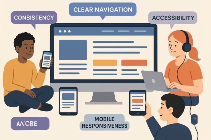
What Makes a Website Easy to Use?
The hallmark of effective web design is leading visitors through content naturally so they intuitively understand where to go and what to do next, without being distracted, frustrated, or overwhelmed. Achieving this level of user experience requires planning. Each aspect, from clickable elements to the journey in mind. Most high-performing, user-, from clickable elements to the overall visual hierarchyfriendly websites are built on four crucial pillars that work in harmony:
- Clear Navigation: Straightforward menus, accurate labels, and intuitive search functions act as digital signposts, guiding users efficiently to the information or features they need. Navigation systems that maintain consistency across every page ensure that users never wonder how to return “home” or locate essential resources. When navigation is done well, it fades into the background, allowing the content to take center stage and users to proceed smoothly with their goals.
- Consistent Design: Cohesiveness in visual language—such as a reliable color palette, legible typography, and standardized button styles—builds a sense of comfort and familiarity. Inconsistent design choices, like a sudden shift in font or button size between pages, can confuse and disorient even tech-savvy users, making them question whether they’re still on the same website. Design consistency signals credibility and encourages effortless exploration.
- Accessibility: A truly user-centered website welcomes everyone, including people of varying abilities. Prioritizing accessibility means choosing ample font sizes, providing descriptive alt text for images, designing logical tab orders, and ensuring sufficient color contrast. Features like screen reader compatibility and keyboard navigability turn good design into universal design and expand the reach of your digital space.
- Responsive Layouts: Users visit websites via smartphones, tablets, laptops, and large monitors, so web design must adapt gracefully to all screen sizes and orientations. Responsive design doesn’t just rearrange elements to fit different screens—it optimizes usability for each device, presenting navigation, text, images, and interactive elements in ways that suit touch and click interfaces.
New research shows that 85% of Americans access the internet daily. This fact highlights the critical role of intuitive, universally accessible digital experiences. User-friendly websites are unnecessary for anyone seeking meaningful interaction, broader reach, and digital relevance.

Quick-Loading Sites: The Secret to Keeping Visitors Engaged
The days when people would resign themselves to waiting for slow-loading web pages are long gone. Multiple studies reveal that even a one-second delay in loading time can reduce user satisfaction, increase frustration, and cause significant upticks in bounce rates. Reports suggest that about 40% of users abandon a site that takes more than three seconds to appear. Businesses and organizations cannot afford to lose nearly half of their site’s visitors simply because pages aren’t optimized for speed.
Effective site optimization includes compressing large image files, using efficient coding practices (such as minifying CSS and JavaScript), leveraging modern content delivery networks (CDNs), and reducing the number of plugins or resource-heavy add-ons.
For example, an online retailer plagued by slow-loading product pages can lose thousands of dollars in potential sales each year. Laggy checkout experiences discourage shoppers and erode trust at the conversion point. Conversely, a fast website boosts customer satisfaction and retention and improves search engine rankings, as speed is a significant ranking factor. Prioritizing quick load times is one of the easiest ways to enhance user experience and deliver consistent value—regardless of industry or audience.
Mobile Responsiveness Is Now Essential
The explosive growth of smartphones and tablets has transformed how, when, and where people engage with websites. Mobile responsiveness is more than just resizing a desktop web page to fit a smaller screen—it’s about rethinking and restructuring the entire experience for fingers and thumbs instead of mouse cursors. Responsive websites don’t just shrink; they dynamically reorganize menus, adjust image resolutions, and ensure links and buttons are comfortably spaced for easy tapping.
With over half of all global web traffic originating from mobile devices, any website that isn’t designed responsively is effectively locking out a massive portion of potential users. Poor mobile experiences—such as tiny text, broken layouts, or hard-to-use navigation—lead to missed opportunities, lost revenue, and negative perceptions of your brand. By embracing mobile-first or responsive design principles, businesses demonstrate their commitment to inclusivity, relevance, and user satisfaction in an “always-on,” device-diverse world.
Prioritizing Accessibility From the Start
Accessibility is not just a regulatory checkbox—it’s the foundation of ethical, modern web design. Following established guidelines, such as the Web Content Accessibility Guidelines (WCAG), ensures that people with visual, auditory, cognitive, or physical disabilities can fully participate in your digital experience. Accessible features might include alt text for images, adequate color contrasts, keyboard-friendly layouts, captions for video content, and logical reading orders for screen readers.
A compelling example comes from a city government website that revamped its digital services based on accessibility audits. Simple changes—like using alt attributes for every graphic, enhancing button contrast, and creating skip-to-content links for keyboard users—resulted in a dramatic uptick in citizen engagement, with more successful, necessary, and essential online forms and processes completed independently. Embracing accessibility broadens your site’s legal compliance and enriches the overall user experience for all visitors.
Listening to Users: Feedback and Analytics
No amount of expert planning can replace the value of genuine user feedback and data-driven analytics. Tools such as pop-up surveys, direct email requests, and session recordings offer firsthand insight into how real users interact with your site. These techniques uncover hidden issues—like confusing layout choices or broken links—that might otherwise go unnoticed. Paired with robust analytics platforms like Google Analytics or heat mapping tools, web teams can track click paths, monitor user flow, identify pain points, and measure the success of ongoing improvements.
Consider an e-commerce site with a high abandonment rate at the payment stage. After reviewing analytics and soliciting feedback, they discovered that the checkout page contained unclear instructions and an overly complex form field. Simplifying the process and clarifying the call-to-action resulted in a measurable increase in sales and positive customer reviews. Continual listening, testing, and improvement mean your website becomes more user-focused over time, ensuring that every update meets user needs.
Simple Steps You Can Take Now
- Perform an audit of your website using free accessibility checkers to find and resolve issues like missing alt text, low color contrast, or problematic navigation. These quick fixes can dramatically improve the experience for users with disabilities.
- Review every navigation path. Are your most visited or valuable pages no more than two or three clicks from the homepage? Streamline your menu architecture to make navigation logical and reduce friction.
- Optimize your site’s speed by compressing images, removing unnecessary plugins, and enabling browser caching. Minor technical improvements can lead to noticeable increases in site performance.
- Test the appearance and usability of your site on various devices, including down-to-budget smartphones. Make adjustments to interactive elements for consistent functionality across platforms and orientations.
- Gather and act on honest feedback from various users, including those navigating with assistive technologies. Use their insights to make practical changes that benefit the wider audience.
Staying Informed On Trends and Best Practices
Web design is a dynamic field where techniques and expectations evolve rapidly. Staying current isn’t just beneficial—it’s essential for maintaining relevance and delivering optimal user experiences. Designers, developers, and site owners must make ongoing education a part of their workflow to ensure they meet users’ ever-changing expectations.
Start by following reputable design blogs, attending virtual conferences, and subscribing to newsletters from industry leaders like Smashing Magazine, A List Apart, or UX Collective. These sources provide valuable updates on design systems, usability research, accessibility standards, and innovative tools. Engage in online communities such as design subreddits, UX groups on LinkedIn, or forums like Stack Overflow to exchange insights and troubleshoot common challenges.
Additionally, routinely benchmarking your site against high-performing competitors can highlight gaps and opportunities. Implementing A/B testing, participating in design workshops, or enrolling in short online courses can sharpen your skills and improve your design choices. By staying informed, you empower your team to build user-friendly websites and future-proof digital experiences that stand the test of time.