Colors influence our emotions, designs, and perceptions in countless ways. A common question that arises in both art and science is what is the opposite of blue. The answer lies in color theory, which explains how colors interact and contrast with one another. By exploring this concept, we can understand not only the artistic applications of color opposites but also their roles in psychology, branding, and daily life.
What Is the Opposite of Blue in Color Theory
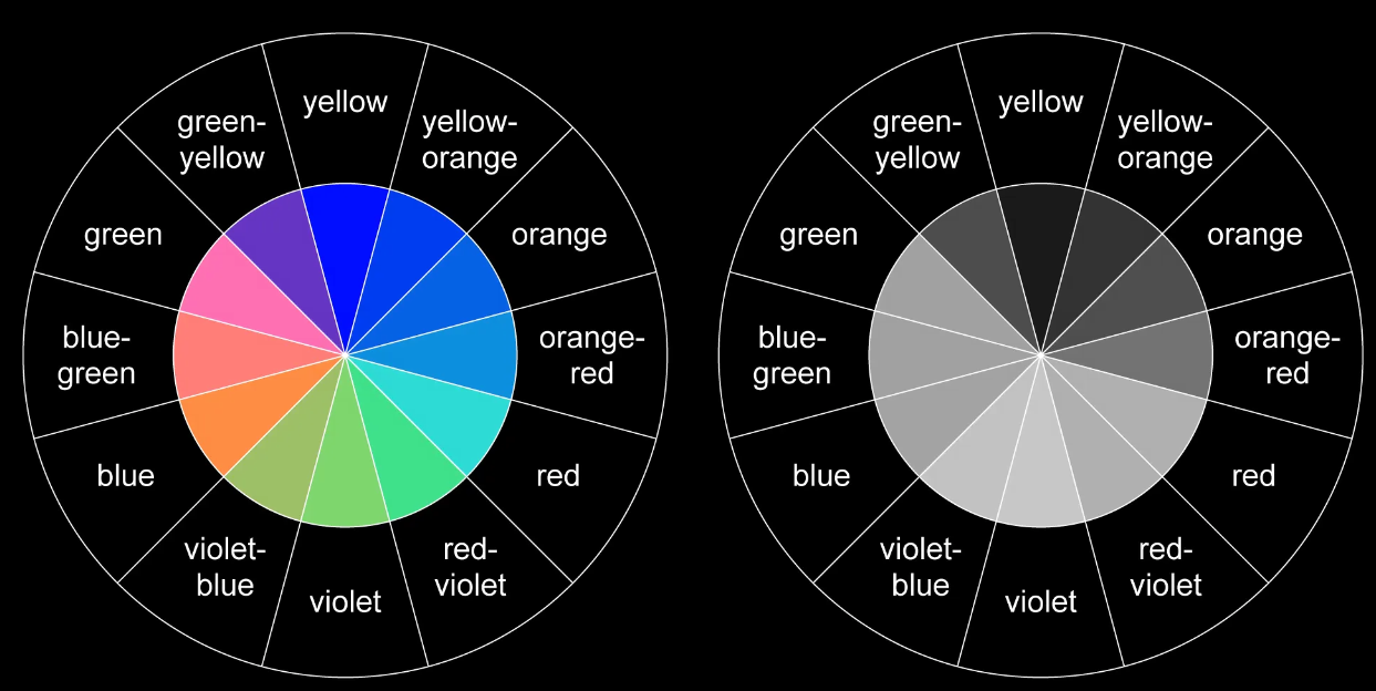
In the traditional color wheel used by artists, what is the opposite of blue is orange. This is because orange sits directly across from blue on the wheel, making it a complementary color. Complementary colors create strong visual contrast and are often used together in design and art to make images stand out.
In modern RGB color models used in digital displays, the opposite of blue is yellow, since combining blue with yellow light produces white. This difference between traditional and digital theory is important for designers, photographers, and anyone working with visual media.\
Also, explore educationbeing com – A Complete Informational Guide
The Psychological Meaning of Opposite Colors
When we ask what is the opposite of blue, we are not just dealing with aesthetics. Colors carry symbolic meaning:
- Blue often represents calmness, trust, and stability.
- Its opposite, orange or yellow, represents energy, enthusiasm, and warmth.
This contrast is why pairing opposites in branding or marketing can create a balanced emotional effect—blue assures stability, while orange adds excitement.
Applications of Knowing the Opposite of Blue
Understanding what is the opposite of blue has practical uses in many fields:
- Interior design: Combining blue with orange accents makes a space vibrant yet balanced.
- Fashion: Blue clothing paired with orange accessories creates a stylish contrast.
- Graphic design: Digital creators use blue backgrounds with yellow highlights to enhance readability and impact.
- Photography: Complementary filters can balance lighting and correct tones.
Scientific Perspective on Opposite Colors
Scientists also study what is the opposite of blue through the concept of afterimages. If you stare at a blue image for a while and then look at a white surface, you may see an orange or yellow afterimage. This happens because of how cones in the human eye respond to different wavelengths of light. The phenomenon provides biological evidence for why certain colors are perceived as opposites.
Cultural and Symbolic Importance
Cultures worldwide have different interpretations of colors. In some traditions, blue is associated with spirituality and protection, while orange symbolizes celebration and vitality. Asking what is the opposite of blue in these contexts helps us understand cultural symbolism and how opposites balance each other in rituals, fashion, and design.
FAQs on What Is the Opposite of Blue
- What is the opposite of blue on the color wheel?
On the traditional color wheel, the opposite of blue is orange. - What is the opposite of blue in digital color models?
In the RGB digital model, the opposite of blue is yellow. - Why are orange and yellow considered opposites of blue?
They lie across from blue on different color systems, creating maximum visual contrast. - How can I use the opposite of blue in design?
Pairing blue with orange or yellow creates balance, energy, and attention-grabbing visuals. - Does the opposite of blue have symbolic meaning?
Yes, blue is linked to calmness, while its opposites—orange or yellow—symbolize warmth, optimism, and energy.
Conclusion
The question what is the opposite of blue opens the door to a fascinating exploration of both science and art. Whether in traditional color wheels, digital design, or cultural interpretation, the opposite of blue can be understood as orange or yellow depending on context. This knowledge helps designers, artists, and everyday creators achieve balance, contrast, and emotional impact in their work. By appreciating the importance of opposites, we can use colors more effectively in our surroundings, designs, and expressions.
Caressa Suzzette Madden: Behind the Scenes with Delonte West's Wife

Diane Plese: A Life Beyond the Spotlight
John Paul Sarkisian: Legacy of an Influential Figure