Typography plays a crucial role in packaging and label design. Every choice, from font style to size and spacing, affects how a product is perceived. While color, imagery, and layout often get the most attention, the typeface used can have an equal or greater impact on readability, brand perception, and overall appeal.
Among various typographic options, condensed fonts stand out as a practical and stylish solution for packaging design.
What Are Condensed Fonts?
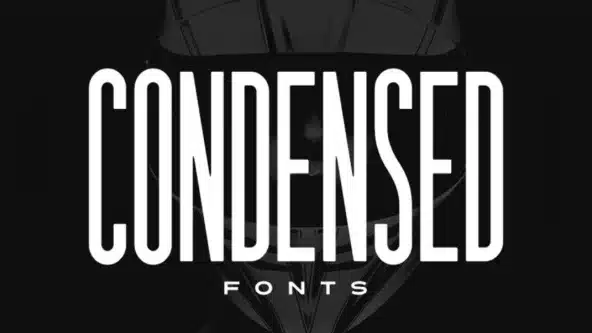
Condensed fonts are typefaces that have narrow letterforms compared to their standard counterparts. This means they take up less horizontal space while maintaining legibility.
Designers often use them when space is limited or when they want to create a compact yet visually striking layout. The narrow structure allows more text to fit without reducing font size, making it easier to present detailed information clearly on small surfaces like labels and packaging.
For an overview of typographic principles and best practices, Adobe’s Typography Guide explains how font choices influence readability and design hierarchy.
Why Condensed Fonts Matter in Packaging Design
Packaging and labels often need to display a lot of information, from product names and descriptions to ingredients and instructions. Wide fonts can make this information appear crowded or force designers to reduce font size, making it harder to read.
Condensed fonts help solve this issue by allowing text to fit neatly without compromising readability. They also create a clean and organized visual hierarchy, guiding the consumer’s eye to the most important details first.
Using Arial Narrow for a Modern Look
A popular example of a condensed font is Arial Narrow. Its versatility makes it ideal for product packaging, from cosmetic bottles to food containers. Arial Narrow balances legibility with space efficiency, allowing designers to include essential information while keeping the layout attractive.
Using fonts like Arial Narrow helps brands maintain consistency across multiple packaging formats, reinforcing brand identity and recognition.
Improved Readability on Small Surfaces
Condensed fonts excel in situations where space is limited. Many products, such as small snack packages, beverage bottles, or cosmetic items, have minimal surface area for text. Using a condensed font allows important information to be clearly displayed without shrinking the text to unreadable sizes.
Key benefits of condensed fonts in small spaces:
- Text fits neatly without reducing font size
- Information remains legible and easy to read
- Important details like ingredients and instructions are visible at a glance
This ensures that customers can quickly and easily read details, which can directly influence purchasing decisions.
Enhancing Visual Hierarchy
Designing effective packaging requires more than just fitting text into available space. Condensed fonts also help establish a visual hierarchy, making it easier for consumers to process information.
Product names, key benefits, or calls to action can be emphasized using a narrow font, while secondary details remain in a standard or lighter typeface. This layered approach improves clarity and makes the overall design more aesthetically pleasing.
Conveying Style and Brand Personality
In addition to practicality, condensed fonts contribute to the overall style of packaging. Narrow letterforms often create a sleek, elegant, and contemporary look. This is particularly valuable for brands that want to communicate sophistication, professionalism, or innovation.
For example, a high-end skincare product or a tech gadget can use a condensed font to project a sense of refinement and precision, aligning the packaging design with the product’s identity.
Maximizing Space Efficiency
Space is always at a premium on packaging. Condensed fonts allow designers to fit more text into a smaller area without overwhelming the design. This is especially important for products that require detailed labeling, such as nutritional information, ingredient lists, or safety instructions.
By making efficient use of space, condensed fonts help ensure that all necessary information is presented clearly while maintaining a visually appealing layout.
Practical Applications in Packaging
The applications of condensed fonts are extensive. They are ideal for headlines, subheadings, product names, disclaimers, and promotional text. Beverages, snacks, and personal care products often rely on narrow typefaces to fit brand names, flavor descriptions, and important details into limited spaces.
Using fonts like Arial Narrow ensures that the text remains readable, attractive, and consistent with the brand identity across various packaging sizes and formats.
Best Practices for Using Condensed Fonts
While condensed fonts offer many advantages, it is important to use them thoughtfully. Designers should balance condensed fonts with adequate spacing, complementary typefaces, and appropriate font sizes.
Pairing a condensed font with a regular or bold typeface can create contrast and improve overall readability. Additionally, paying attention to line height and kerning ensures that the text remains comfortable to read.
Conclusion
Condensed fonts are a powerful tool in packaging and label design. They improve readability, maximize space, support visual hierarchy, and create a modern, professional appearance. Using fonts like Arial Narrow allows designers to communicate key information clearly while maintaining a clean and attractive layout.

7 Reasons Travelers in 2026 Are Switching to eSIM Before Every Trip (And Why You Should Too)

AZ-900 Exam Dumps 2026: Updated Questions to Pass Azure Fundamentals First Try

How Effective Is PRP Therapy for Hair? The Definitive Guide to Restoring Your Hair


