Color is one of the first things people notice in branded products. Even when the logo is simple, poor color choices can make the final item look messy or cheap. Consistent color planning helps accessories feel more professional and easier to recognize.
For brands ordering hats, beanies, socks, bags, or uniforms, color should be planned before production. This is especially true for custom beanies with logo, where the base color, thread color, patch color, and logo contrast all affect the final look.
Start with Your Main Brand Colors
Most brands already have one or two main colors. These should guide the product design.
Use One Main Base Color
The base color is the largest visual area. It should be wearable and easy to match.
Use Accent Colors Carefully
Accent colors can appear in logos, stripes, labels, patches, or small design details.
Do Not Use Too Many Colors
Too many colors can make accessories look unfocused.
Limit the Palette
A simple palette with one base color, one logo color, and one accent color is usually enough.
Keep Contrast Clear
A logo should be easy to see. Low contrast may look subtle, but it can also make the design hard to recognize.
Match Color with Decoration Method
Color does not behave the same way across embroidery, printing, patches, and woven labels.
Embroidery Thread Has Texture
Thread can make colors look slightly different from flat digital artwork.
Printing Can Show More Color Detail
Printing may be better for gradients or colorful graphics, depending on the product surface.
When choosing between methods, this guide on embroidery vs printing for hats can help brands understand how the final color and texture may change.
Consider the Product Material
Material affects how color appears.
Knit Fabric
Knit texture can make colors look softer and less sharp.
Cotton and Canvas
These surfaces often show color more clearly, especially when the fabric is smooth.
Performance Fabric
Shiny or stretch fabric may reflect light differently, changing how the color looks.
Build a Consistent Product Set
If a brand orders multiple accessories, the colors should feel connected.
Use Related Colors
The beanie, socks, bag, or cap do not need to be identical, but they should look like they belong together.
Keep Logo Treatment Consistent
If one item uses a small clean logo, the others should not suddenly use a huge graphic unless there is a clear reason.
Final Thoughts
Color consistency makes branded accessories look more intentional. A simple color plan can improve the final product more than adding extra decoration.
Choose wearable base colors, limit the palette, check logo contrast, and match the color plan with the decoration method and material.
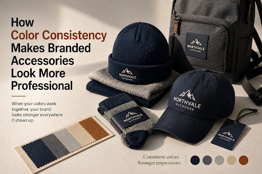
How Color Consistency Makes Branded Accessories Look More Professional

No Guesswork, No Wasted Budget — This Is How Real SEO Work Begins

Why You’re Overcomplicating Your Donation Experience On Your Website